
INTRODUCTION
Epigon.AI is an AI NPC cross-platform where users can create and train their own virtual characters. I have been working on this project since July 2023, and the initial MVP version is currently available online.
Role: UX/UI Lead
Team: 1 UX designer + 1 UI artist (+ me)
Timeline: 07/2023 - (WIP)
Tools: Figma, Photoshop, VS Code, etc.
My ROLE and RESPONSIBILITIES
As the UX/UI lead, my role is to conduct research, create wireframes and mockups, design for interaction flows, collaborate with developers, test, iterate, and optimize the cross-platform design library.
My primary responsibility is to ensure a seamless and user-centric experience on different devices and platforms. I work closely with various stakeholders throughout the design and development process to develop a high-quality final product.
METHODOLOGY
I initiated this project by conducting desk research and analysis. Following the initial research and analysis results, I developed the Website Map / Brand Identity / Style Guide / Design Documents / Visual Mockups / Interaction Prototypes and more.
Afterward, I configured the UI assets in VS Code using CSS.
Problem #1 - LACK OF BRAND IDENTITY
When I hopped on board, I observed a significant lack of the platform's visual aesthetics. It was evident that there was a notable absence of a strong brand identity and effective marketing guidelines. This deficiency was adversely impacting the platform's ability to create a positive first impression and provide a user-centric experience.

(Screenshot: Original website homepage)

(Screenshot: Original website chat)
Solution
To address this issue, I conducted extensive research, organized an interview with the product owner, and performed a comparative analysis. All these works allowed me to develop a brand identity guide for Epigon.

(InfoGraphic: Brand Identity, Figma)
Problem #2 - NAVIGATION CONFUSION
The original platform featured numerous pages added without a clear organizational structure. This lack of organization made it challenging for users to navigate and comprehend the platform's content and services.
Additionally, the layout deviated from the conventions commonly seen in UX design. This discrepancy was apparent through various surveys and statistical data found in other reports.
Solution
So, I set the goal for the website to improve the platform's usability by implementing a more coherent information architecture. This will allow visitors to easily find what they're looking for and learn more about the content.
The user flow was designed to enable access to any information within no more than three levels, streamlining the navigation experience.

(Screenshot: New Info Arch, Figma)
After analyzing the pages using the new information architecture and the new brand identity, I have started creating a new style guide and structuring UX assets' contents with design documents for other team members.
CREATING A NEW
VISUAL STYLE
The idea was to use the symbolism of blue and green colors to represent the seamless integration of technology and humanity.
The blue color will be our primary color, representing qualities like Technology/Trust/Innovation.The green color will be our secondary color, symbolizing the digital life of the AI characters.

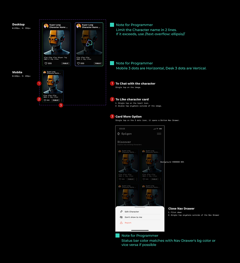
STRUCTURING THE CONTENTS
Organizing the structure of each page of the website, designing UX components, and preparing UX design documents in Figma.
Interested in reading more?


